

April 13, 2024
Written by
Becca Levian

Your website is often the first impression potential clients have of your business. But what if your site is turning them away instead of drawing them in? Don't worry – I'm here to help you identify the flaws and transform your website into a powerful tool for attracting clients. Let's dive in!
1. Poor User Experience: Is your website difficult to navigate? Are visitors struggling to find the information they need? Confusing navigation and cluttered layouts can drive users away faster than you can say "bounce rate."
2. Lack of Visual Appeal: Your website may be visually unappealing due to outdated design elements, poor color choices, or low-quality images. Remember, first impressions count – and pixelated graphics won't leave a positive one.
3. Content Overload (or Underload): Finding the right balance of content is crucial. Too much text can overwhelm visitors, while too little leaves them hungry for information. Striking the right balance is key to keeping users engaged.
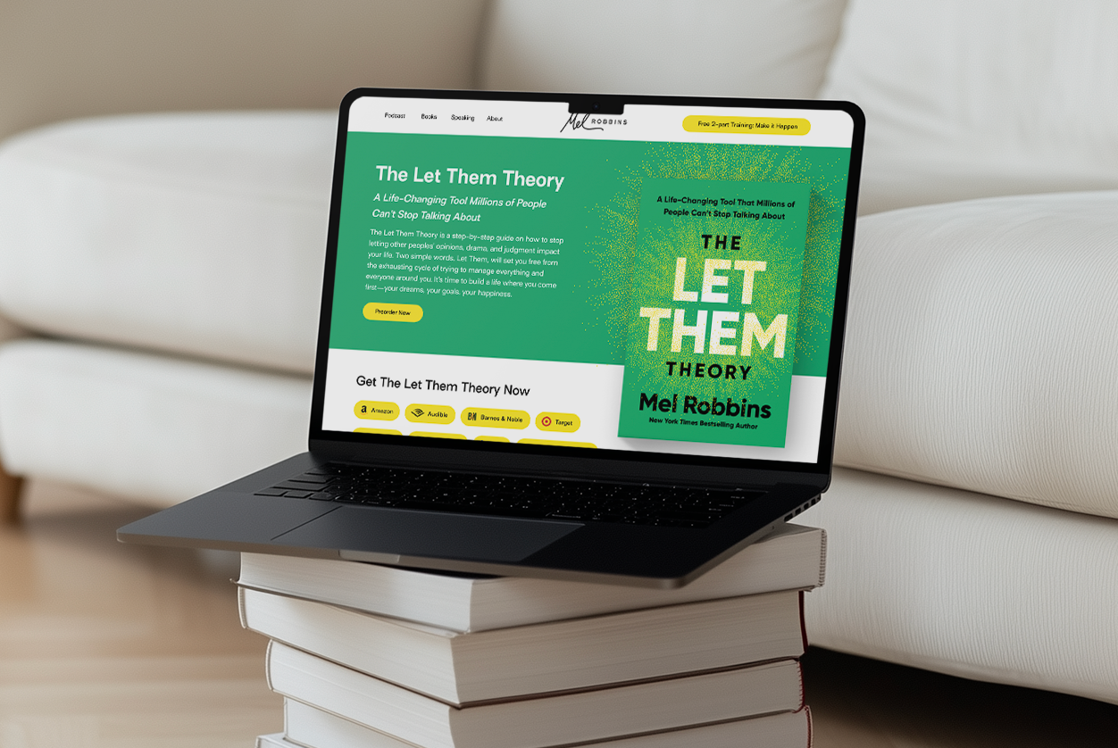
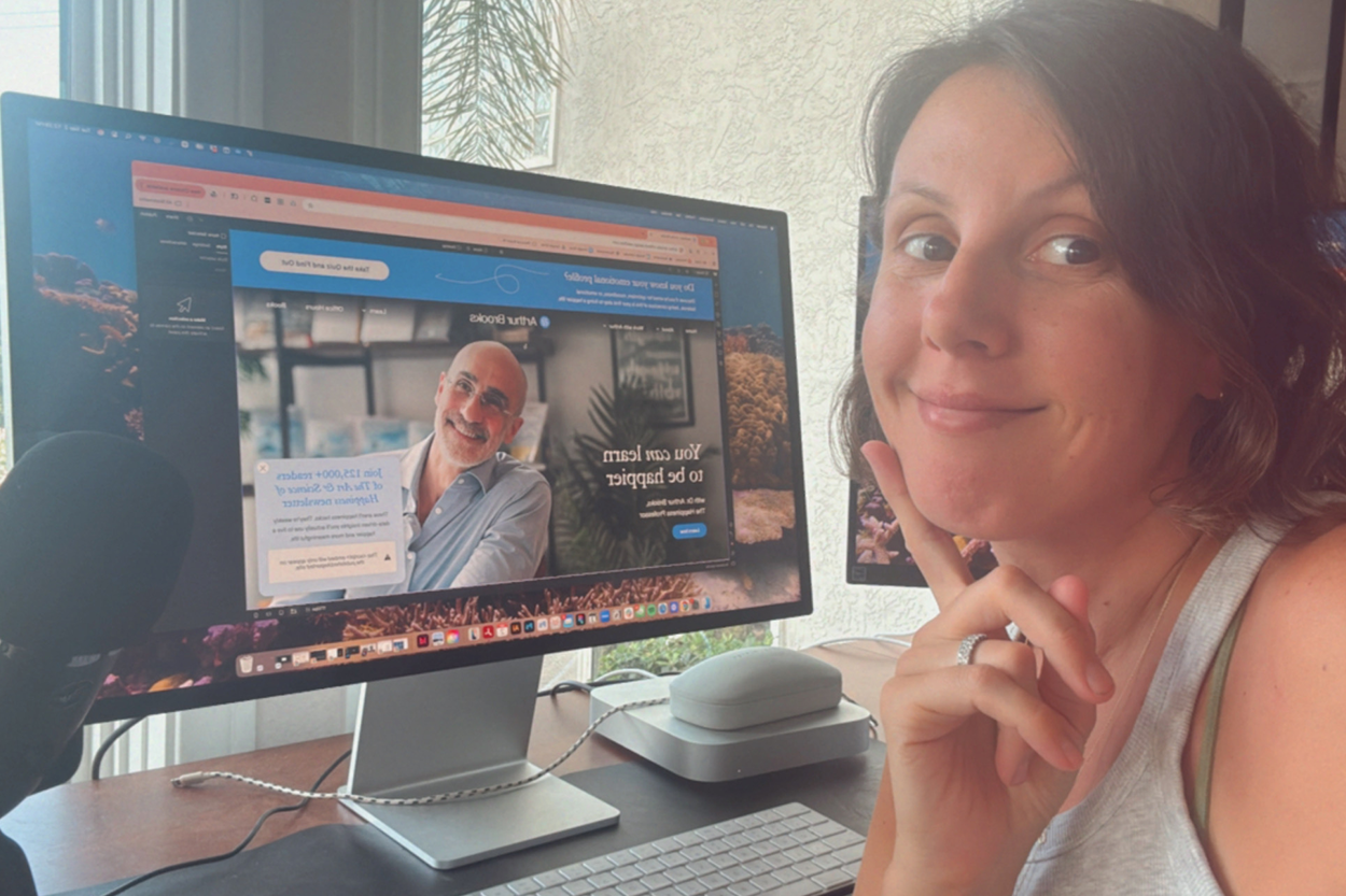
1. Homepage: This is your virtual storefront, so make it count! Clearly communicate who you are, what you do, and why visitors should stick around. Keep it clean, concise, and visually appealing.
2. Portfolio/Work Samples: Showcasing your best work is essential for winning over potential clients. Organize your portfolio logically and make it easy for visitors to browse through your projects.
3. About Page: People want to know the person behind the brand. Use this space to tell your story, showcase your expertise, and build trust with your audience.
4. Contact Information: Don't make visitors hunt for a way to reach you. Make your contact information easily accessible on every page of your website.
1. Optimize for Mobile: With more users accessing the web on mobile devices, it's crucial that your website looks and performs well on smartphones and tablets.
2. Focus on Legibility: Choose fonts and colors that are easy on the eyes and ensure that text is readable on all devices. Don't sacrifice legibility for style.
3. Streamline Navigation: Keep your navigation menu simple and intuitive. Visitors should be able to find what they're looking for in just a few clicks.
4. Optimize Images: Use high-quality images that showcase your work effectively. Compress images to improve load times without sacrificing quality.
5. Call-to-Action (CTA): Every page should have a clear CTA guiding visitors on the next step to take – whether it's contacting you, viewing your portfolio, or signing up for your newsletter.
6. Opt-In Forms: Capture leads by strategically placing opt-in forms throughout your site. Offer something of value in exchange for email addresses, such as a free resource or newsletter subscription.
Your website is your online storefront, and it should reflect the professionalism and quality of your design work. By addressing common issues like poor user experience, lackluster design, and content imbalance, you can turn your website into a powerful tool for attracting and converting clients. Remember, it's not just about looking good – it's about delivering an exceptional user experience that leaves visitors eager to work with you.
We'd love to work with you. Contact us today to get started.

Get the most kick-ass emails that will skyrocket your business!

Lorem ipsum dolor sit amet, consectetur adipiscing elit. Suspendisse varius enim in eros elementum tristique. Duis cursus, mi quis viverra ornare, eros dolor interdum nulla, ut commodo diam libero vitae erat. Aenean faucibus nibh et justo cursus id rutrum lorem imperdiet. Nunc ut sem vitae risus tristique posuere.