

November 24, 2025
Written by
Becca Levian
If you’ve ever released a book — or are gearing up to — you already know one truth:
writing the book is only half the job.
The other half is getting it into the hands of the people who need it most.
A high-converting book sales page is one of the most overlooked pieces of an author’s marketing ecosystem. And yet, when it’s done well, it becomes the hardest-working asset in your entire brand. It runs 24/7. It sells while you sleep. It answers the questions you’ll never hear. It builds trust, makes the experience feel personal, and nudges someone from “This looks interesting…” to “I’m in.”
We’ve built book pages for authors across the spectrum — from journalists to therapists, from Emmy-winning anchors to bestselling personal development voices. And after designing these pages for many of our clients, we’ve noticed something consistent:
the highest-performing pages all follow a very similar rhythm.
What follows is exactly how we build book pages at Skye High — structure, flow, storytelling, and design choices included.
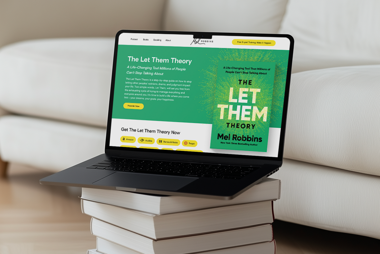
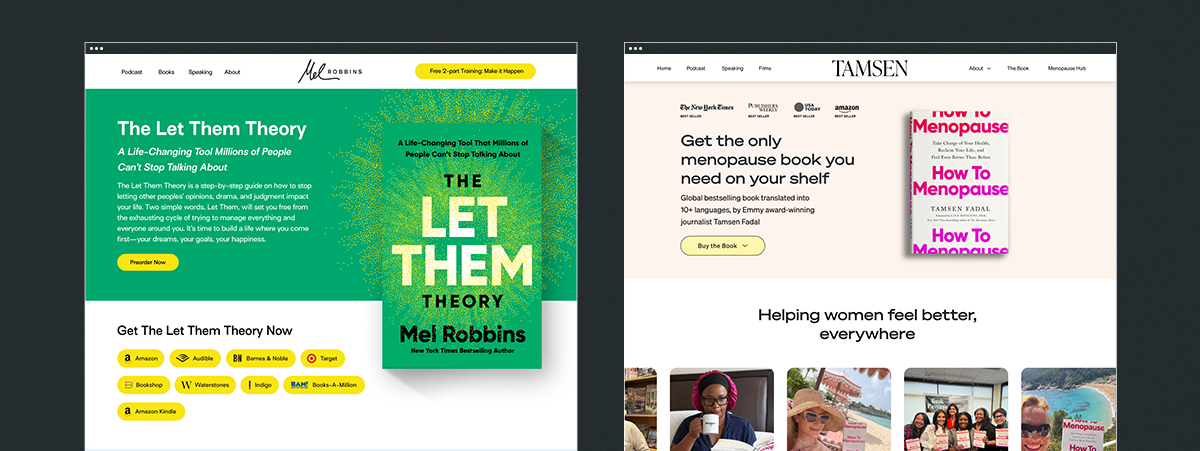
The hero section is the handshake. It’s the moment someone glances at the page and instantly decides whether they’ll scroll or bounce. So the goal here is clarity and confidence — not cleverness.
We always lead with the book cover, front and center. A strong, benefit-driven headline. A short, crisp subhead that tells us what the book does, not just what it’s about. And right there — above the fold — a clean call to action to purchase or pre-order.
The design here should feel effortless: open space, intentional typography, and a CTA that stands out just enough without screaming. Think high-end, not high-pressure. If you’ve got a killer endorsement, this is a great moment to use it as a trust anchor without taking attention away from the cover.
Right below the hero is where we orient your visitor. In a few short paragraphs, we want them to understand:
Not in jargon. Not in abstract themes.
In simple language that speaks to someone’s life, challenges, and hopes.
This is usually where we introduce the “promise” of the book — the transformation at the heart of it. And if the book is built on a distinctive framework or method (like Tamsen’s menopause pattern work or Lynn’s anxiety approaches), we tease it here. Not the whole breakdown — just enough to pique interest.
Visually, this section should breathe. Think clean layouts, skimmable highlights, and maybe a bold pull quote or two.
People don’t just buy books. They buy trust.
And trust is built through connection.
Your author bio shouldn’t read like a résumé. It should feel warm, dimensional, human. Yes, include credentials and accolades — but anchor them in voice and story. We want someone to feel like they’re meeting the person behind the pages.
Pair this with a great photo — ideally something professional but not stiff. Something that captures personality. A moment. A little humanity. We’ll often place this section on a soft color block to create contrast and help it stand out in the flow.
This is where curiosity turns into clarity.
You don’t need to list every chapter. What you should do is highlight the core themes or sections of the book — the ideas that anchor the reader’s journey. This could be structured as:
We like to keep it simple, visual, and easy to scan. A two- or three-column layout, clean icons, subtle design elements… enough structure to guide the eye without overwhelming it.
This is the moment someone thinks, “Oh. I need this.”
A great endorsement carries more weight than ten paragraphs of explanation. So this is where testimonials, praise, and recognizable names can truly shine.
We’ll often create a scrollable carousel or a multi-card section that features:
If you’ve been featured anywhere — articles, TV, podcasts — this is also where we start introducing media credibility, either in a dedicated section or subtly woven between content blocks.
Design-wise: keep it polished, modern, balanced. No mismatched headshot sizes. No chaotic grids. Social proof deserves more respect than that.
One of the most effective conversion boosters during launch periods is offering bonuses.
Think worksheets, audio segments, a companion guide, a discount on a course — anything that deepens the reader’s connection to the book while giving them a reason to order now instead of later.
If you’re offering bonuses, we’ll make them look exciting and valuable — bold boxes, clear visuals, and simple steps for redeeming them. If they’re limited, we’ll emphasize that in the design.
Some readers shop on Amazon.
Some on Bookshop.
Some want Audible.
Some want signed copies.
A good book page accommodates all of that without making the layout chaotic.
We list the major retailers with clean, consistent icons and simple buttons. We’ll often keep retailer logos monochrome for an elevated feel, with color on hover to create that little spark of interactivity.
It’s practical and beautiful — our favorite combination.
This section is optional, but when an author has it, it’s powerful.
Press features, podcast spots, and media mentions build instant authority. Even one or two recognizable logos can shift perception. We usually place these in a dedicated block — clean, minimal, restrained. No intense colors. Grayscale logos keep it elegant.
A short FAQ goes a long way.
Shipping? Formats? Bonuses? Audiobook? International orders?
If someone is even thinking about these questions, we want the page to answer it for them.
We usually present this in an accordion-style layout — simple, efficient, clean.
By now, the visitor has all the information they need. So we end with a clear, confident call to action: Buy the book. Pre-order now. Get your copy.
This section typically sits on a bold color block or with a full-width design moment that feels conclusive and energizing.
Throughout the page, there are a few design philosophies we never stray from:
Consistency always wins.
Typography, spacing, and color hierarchy should feel cohesive, not copy-and-paste.
Make the book the star.
Clean mockups, high-res cover files, subtle shadowing — these details matter.
Mobile-first matters more than ever.
Most people will see your book on their phone. We design accordingly.
Photography > stock images.
Real photos of real humans — especially the author — always elevate the experience.
Hierarchy is everything.
The page should guide the eye, not bombard it.
Fast load times = higher conversions.
Clean code, compressed images, no heavy auto-play videos.
If you’re planning a book launch and want a page that converts, this is one of our favorite things to build.
(And we’re pretty good at it.) To start the process, simply reach out!

Get the most kick-ass emails that will skyrocket your business!


Lorem ipsum dolor sit amet, consectetur adipiscing elit. Suspendisse varius enim in eros elementum tristique. Duis cursus, mi quis viverra ornare, eros dolor interdum nulla, ut commodo diam libero vitae erat. Aenean faucibus nibh et justo cursus id rutrum lorem imperdiet. Nunc ut sem vitae risus tristique posuere.